← Back to all work

Perry Angelora

the.times.pilot

Tailoring Your NY Times Digest

Seamlessly curate and receive the stories that matter to you with a custom news aggregator and subscriber-focused daily email service.

A More Personalized News Experience

The.times.pilot looks to improve the news consumption experience by offering a personalized, accessible, and navigable platform that leverages the New York Times Top-Stories API. It addresses the lack of personalization and a one-size-fits-all approach present in the news media, specifically for The New York Times readers.

Tools:

  • Figma

  • TypeScript

  • React

  • Next.js

  • Storybook

  • SCSS

  • Firebase NoSQL

  • Node.js

  • GCP Cloud Functions

  • GCP Cloud Scheduler

  • Twilio SendGrid

Role: Concept, Design, Development

What Was The Problem?

Despite the New York Times's devotion to world-class journalism and forward-looking user experiences, users struggle with the time commitment required to sift through the various sections and placement hierarchies to find stories that match their interests. Additionally, there's an absence of customizability in the daily top-stories emails.

What Were Users Saying?

Users were frustrated with being forced to browse through topics they felt to be overwhelming, and often depressing. This highlighted a desire for a more tailored news/news-email experience. Some specific problems were:

  • Lack of customization (NY Times doesn't provide a way to have a user organized news homepage).
  • There is no way to customize the daily top-stories emails.
  • Exposure to topics ill-fitting to their tastes.
  • The news is too depressing to look at all the time.

The Approach

Provide users the means to personalize their daily email

With the subscribe/unsubscribe feature, users are empowered to curate their daily email content based on their interests, moving away from the traditional one-size-fits-all model. This significantly improves user engagement by promoting a more interactive approach to the news.

Read More…

Enhance Content Accessibility

By shifting from the traditional newspaper hierarchy to a model of content equality, users are impelled to explore a wider range of articles without the bias of page prominence influencing their choices. Recognizing that our perception of the world is influenced by time and sequence, achieving a completely neutral experience may be challenging. However, by equalizing content presentation, significant steps are made towards a more balanced and inclusive user experience.

Read More…

Bring focus and calm by allowing users to choose what news sections are presented to them

When users are afforded straightforward options to tailor their news intake, we enable them to foster a deeper relationship to the content that interests them—unburdened by content they're not interested in.

Read More…

Allow easy access to all settings

There shouldn't be extraneous steps when wanting to update news topics, preferences, account info, or access bookmarked stories. Access to all of these settings are reachable through a single button click.

Read More…

Design Considerations

  • Highly Visible: High contrast ratios and system-relative font sizes are selected to cater to users with suboptimal eyesight, while still maintaining a pleasing aesthetic.
  • Unencumbered Navigation: Users can navigate around the site without being logged in or having an account, while access to member features remains blocked.

  • User-Account Autonomy: Users maintain complete control over their accounts, enabling them to modify all informational aspects freely, without any dark patterns.
  • No Spamming: Only send emails when there is an intersection between the topics the user wishes to see and the top stories of the day.
Typefaces

Aa

Museo Slab Rounded - 500

A big fjord vexes a quick waltzing nymph

Aa

Forma DJR Micro - 400

A big fjord vexes a quick waltzing nymph

Aa

Forma DJR Micro - 900

A big fjord vexes a quick waltzing nymph

Colors
  • Darkest #262626

    CR = 13.51:1

  • Dark #3D3D3D

    CR = 9.7:1

  • Lightest Text #767676

    CR = 4.54:1

  • Background #F3F2EF

    CR = 1:1

  • Green #368433

    CR = 4.66:1

  • Warning #F58F00

    CR = 2.18:1

  • Error #DC0105

    CR = 5.18:1

  • Accent #CCFF00

    CR = 9.24:1

High-Level Site Flow

It's important that users are able to get a sense of what the site has to offer without going through the signup process. Too often users are forced through a signup funnel only to find out they're not interested in the product. To allow this, the site is set up in a tiered fashion, where an unauthenticated user can still look around, but they will be unable to save articles or subscribe to email topics, as those functions require an email address.

Problems Met, Issues Solved

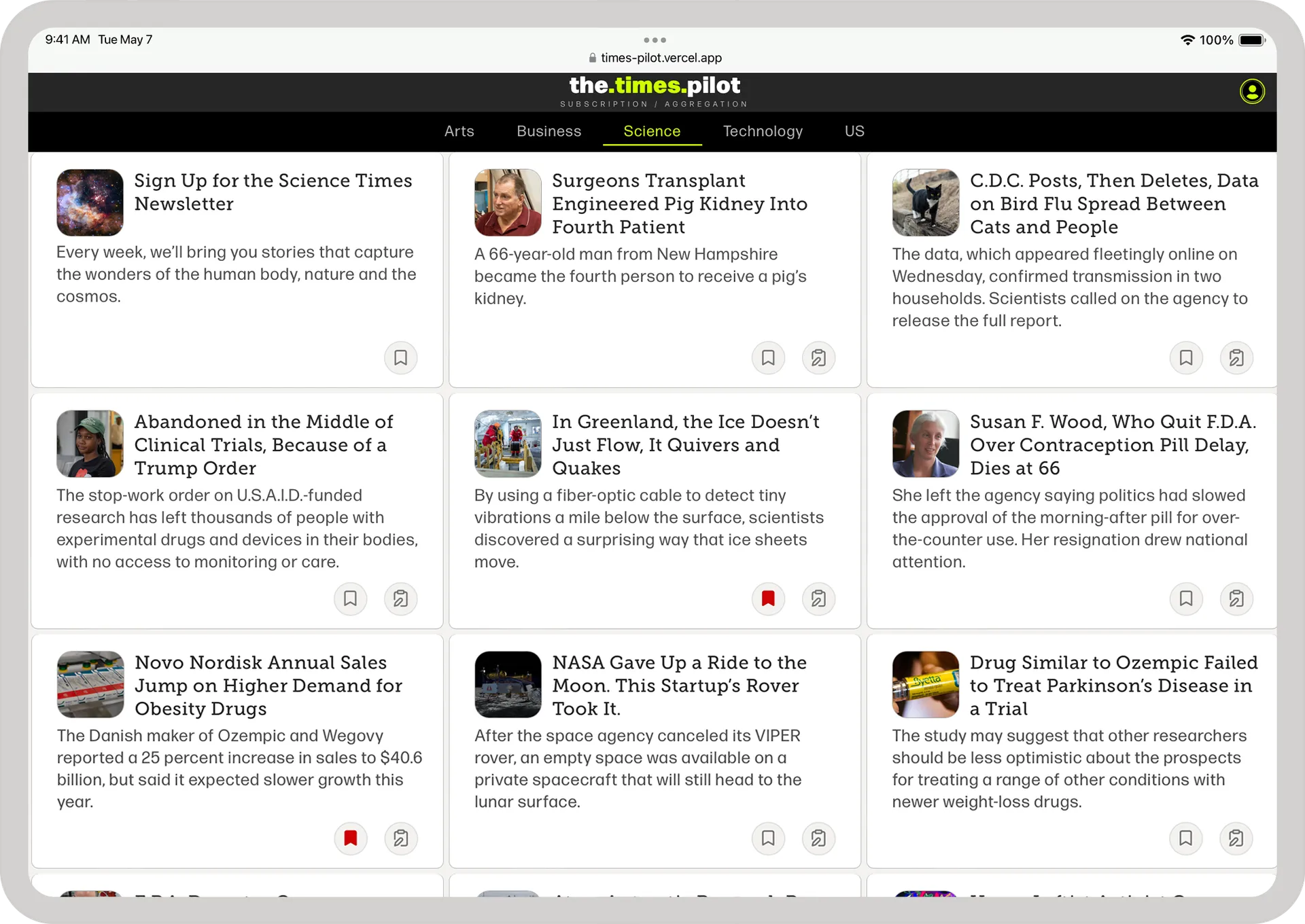
  • Creating article-card interactions that utilize the inherent attributes of the screen; be it mobile or tablet/desktop.
  • When displaying article-cards on a tablet or desktop environment there are occasions where we have a full row preceding a row with one article—and the remaining space is empty and unutilized. This was a hamper on usability and aesthetics, and needed to be rectified.
  • Developing a new account sign-up flow that expeditiously guides the user through the several steps of account creation—while also being tolerant to stalled signups and premature exits from the sign-up flow.

Desktop Article Card versus Mobile Article Card

Because interaction with mobile is done with fingers (not a pointer) and space is at a premium, the mobile implementation of bookmarks uses modified placement of the bookmark flag, and a slide-to-reveal interaction. A common and, now, natural interaction on mobile devices.

Read More…

Optimizing Article Layout

When organizing article summaries, efforts were made to create a consistent, unbiased format. This included addressing layout gaps caused by too few articles to fill the space. This was solved by calculating headline and description lengths, which allowed the prioritization of the five longest summaries to fill any excess space. This enhanced the visual appeal and readability, thereby engaging users more effectively.

Read More…

New User Signup Flow

Once a user enters a username, email, and password—they will have an account; whether or not they go through each signup step or if they get to the end of the flow.

Read More…

User enters their username, email, and password. Contact database and check that email isn't in use. If it's a new email, we create a unique uid (user id) within the auth database. We then allocate space within the NoSQL database for the new user under their uid.

User chooses which sections are exposed to them. If we exit from this point, the user will have default settings applied.

Further personalize with an avatar. To allow for a personal experience we can accept an avatar.

Signup completed. If they get to the end, the user is shown a confirmation of account creation.