P.

the.times.pilot

Tailoring Your NY Times Digest

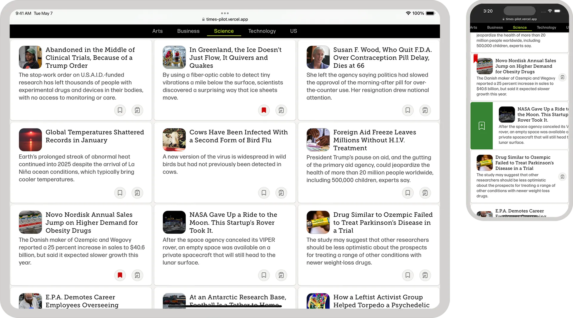
Tablet and mobile view of the.times.pilot

Tools

Figma, TypeScript, React, Next.js, Storybook, SCSS, Firebase NoSQL, Node.js, GCP Cloud Functions, GCP Cloud Scheduler, Twilio SendGrid


My Role

Conception, Planning, Design, Development, Deployment

Problem

Handling a World of Information

For most users, there's a struggle with the time commitment required to sift through the multiple sections and placement hierarchies to find stories that match their interests. Additionally, there's an absence of customizability in the daily New York Times top-stories email.
Approach

Provide a Way for Users to Personalize Their Daily Email Digest

With the subscribe/unsubscribe feature, users are able to curate their daily email content based on their interests. This is a step away from the traditional, one-size most popular model. This significantly improves user engagement by promoting a more interactive and predictable approach to the news.

Level Content Accessibility

Moving from a print-derived hierarchy to one of content equality, users are impelled to explore articles without the influence of page prominence.

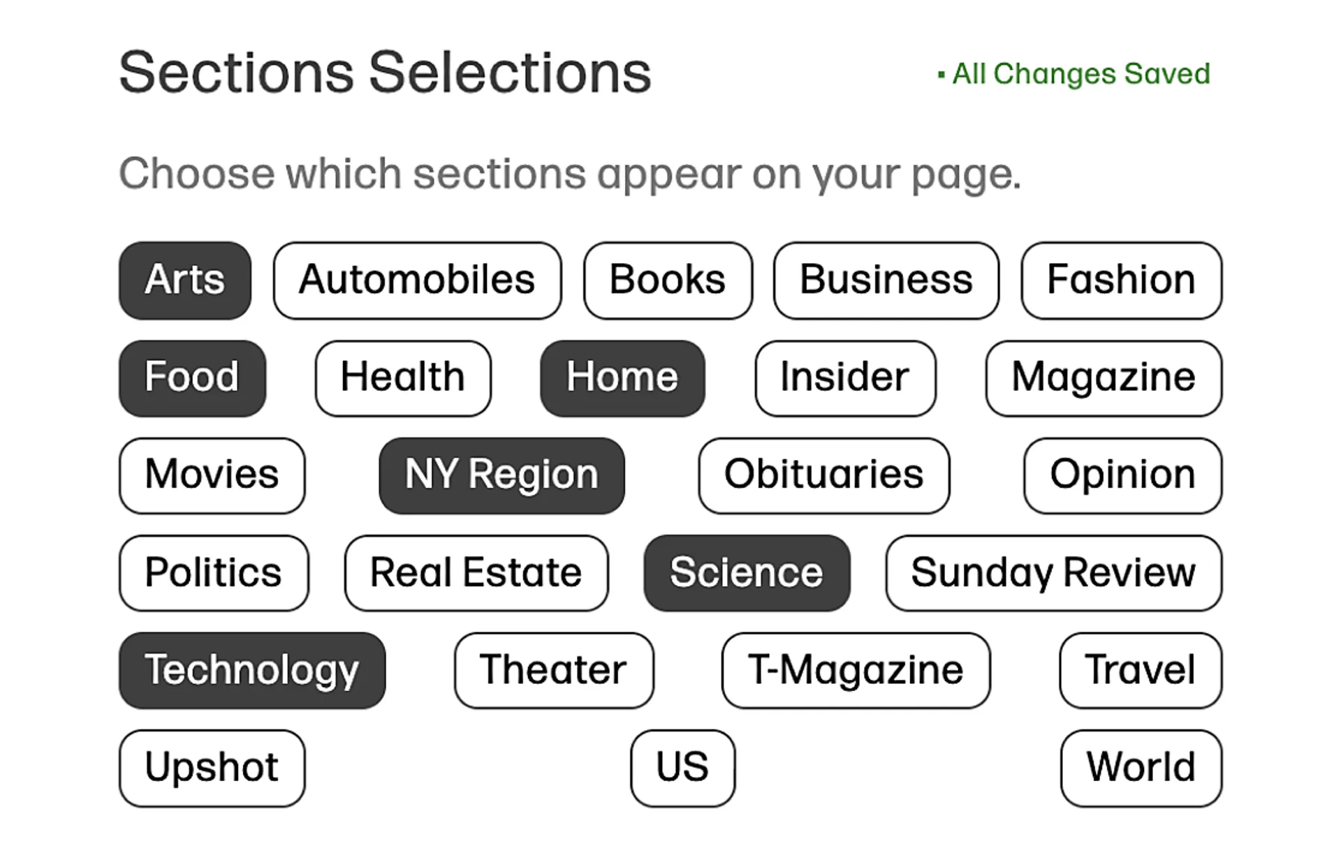
Provide Choice in What Sections Are Visible

When users are afforded the option to tailor their news intake, we facilitate a more active relationship between the user and the content that interests them. With that, the user is able to omit content they may find triggering, which furthers their feeling of control and connection.

A closeup view of how the user can toggle each section into or out of view

Easy Access to Settings

Everything the user needs to manage their account: From updating news topics, preferences, account info, or bookmarked stories, it's all available in a single click.

High-Level Site Flow

It's important that users can get a sense of what the site has to offer without going through the signup process. Too often, users are forced through a signup funnel only to find out they're not interested in the product. To allow this, the site is set up in a tiered fashion, where an unauthenticated user can look around, but they cannot save articles or subscribe to email topics, as those functions require an email address.

Challenges/Considerations

Rate Limit? LRU to the Rescue

With rate limits placed on API calls, an LRU cache was implemented. The cache stores API fetches for 12 minutes, thus allowing every section to be requested once (in a 12-minute period). This allows multiple users to request the same content without running afoul of the API rate limit and with the benefit of delivering a low-latency experience.

Article Cards: Desktop vs. Mobile

With limited real estate available on mobile devices, we are able to capitalize on the native, gesture-based navigation for our bookmark component by using a side-to-reveal interaction. For tablet and desktop implementations, where space conservation is not an issue, we are able to have a simple button toggle.

Mobile Implementation
Desktop Implementation

Optimizing Article Layout

When organizing article summaries, there is a focus on creating a consistent, unbiased article flow. This includes addressing layout gaps caused by too few articles to fill the space. A solution was found by calculating headline and description lengths, which allowed the prioritization of the five longest summaries to fill any excess space.