Hoop State Gameflows
Hoop State Gameflows is a data-gathering and presentation framework that turns NBA game data into visual, contextual breakdowns — lineup rotations, score-margin trends, shot charts, and full box scores.
The Idea
For years I've been a fan of the NBA stats site popcornmachine.net — a project that, remarkably, dates back to 2003 and quietly built one of the longest-running, free game-level stat viewers on the web. (Its name comes from a quip by legendary Lakers announcer Chick Hearn: "He put him in the popcorn machine...he's got salt and butter all over him.") After the site went quiet at the beginning of 2026 — and after waiting a few months in hopes it would return — I decided to build a modern take on the idea it championed: a visual, stats-first look at NBA games.
System Outline
The site is constructed in three parts: the Orchestration Layer, the Ingest Layer, the Presentation Layer.
Orchestration Layer
- Using a persistent macOS LaunchAgent, scripts are automatically executed every morning to poll the latest game data, build the game pages, test the build, and deploy the update.
Ingest Layer
- The ingest layer, triggered by the orchestration layer, is the data-gathering layer, using SQLite as a durable storage framework.
- Gathering data from a trio of endpoints, we populate 5 tables with game data. From box scores to per-play game actions.
Presentation Layer
- The presentation layer is designed to be cleanly minimal, easy to browse and compare, and fast.
- Each game is pre-rendered into its own lightweight (~700KB) static webpage, eliminating API fetches and hydration lag while maximizing page-load speed and browser caching.
- Chart components (bar chart, game-flow, shot chart) were built and tested in isolation via Storybook.js before being wired into the static page templates.
Key Decisions
The volume of data I process is staggering. For each season there are approximately 600,000 rows of data, with as many as 32 factors per row. That scale necessitates several conscious technical and design decisions.
Balance page weight and performance
- Serve pre-built pages instead of hydrating them at browse-time from a SQLite database; removing the Node.js server entirely and letting the site run as static files on S3 + CloudFront.
- Build-in micro enhancements like GPU acceleration, cacheable svg icons and aggressively-cached static pages.
Present the data clearly without overwhelming the user
- Arrange sections hierarchically to present and compare data. We go from stat vs. stat, to team vs. team, to player-level vs. player-level.
- To minimize visual fatigue, we tried to keep all information scannable with additional info presented via mouse-overs.
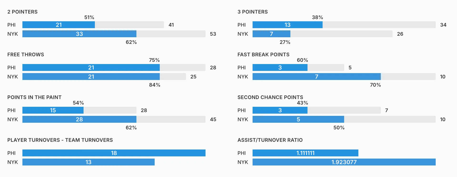
Bar charts to allow stat vs. stat comparison
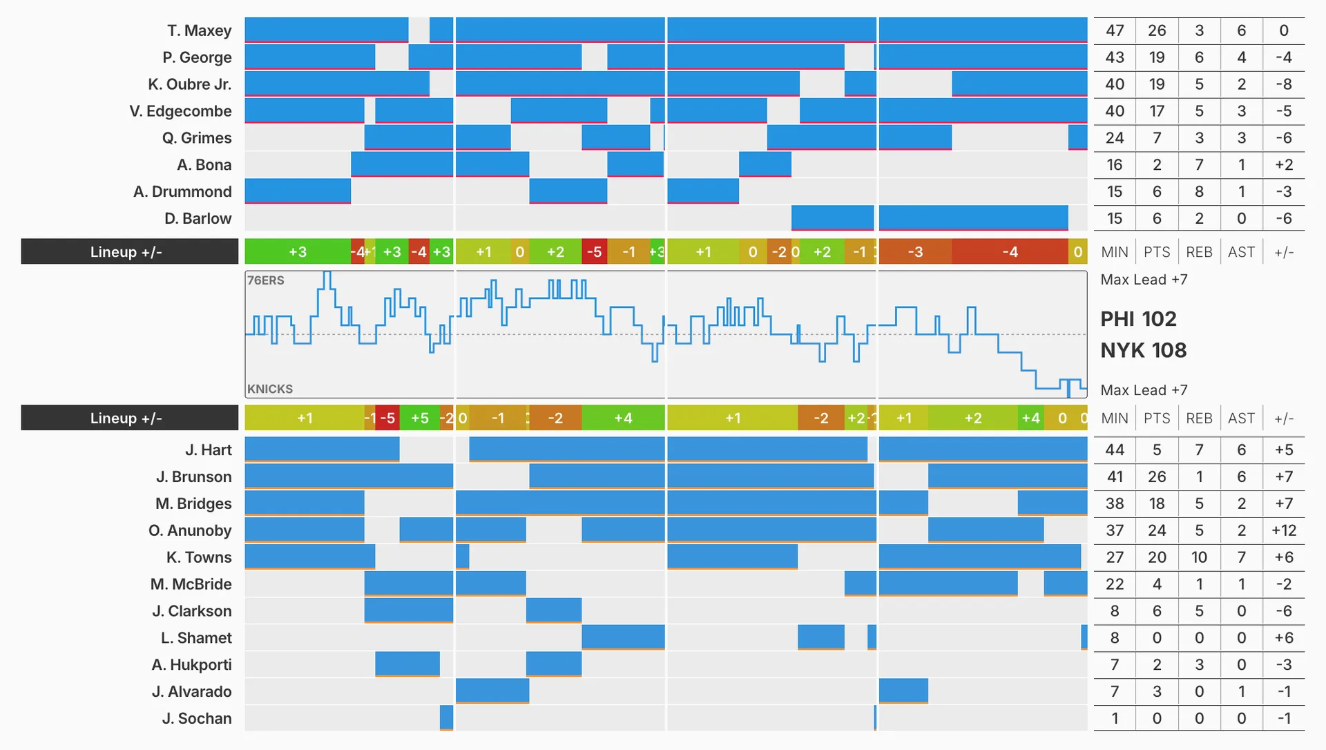
Time-based score-margin chart paired with lineup plus/minus, to visualize the push and pull of intra-game battles.
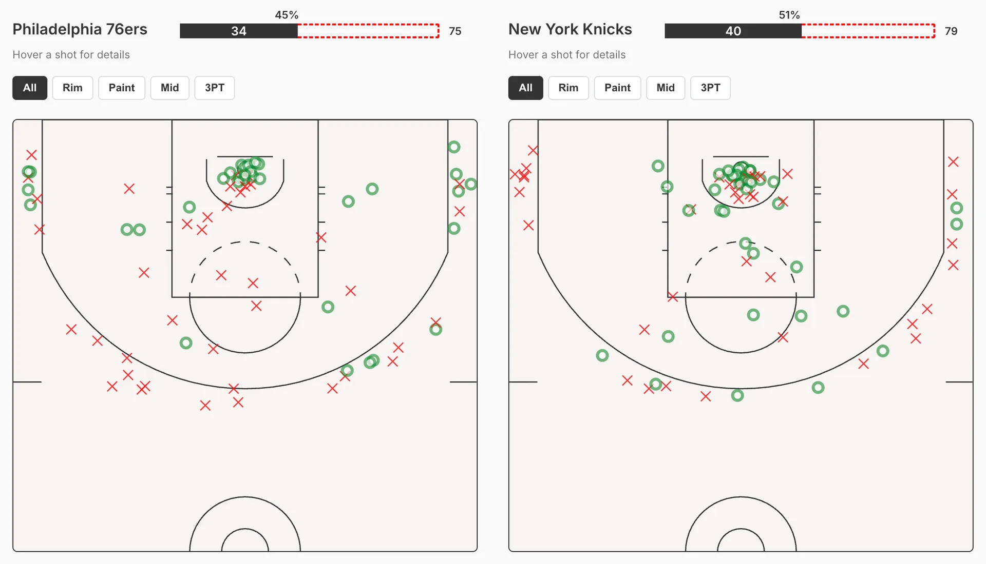
Shot charts to give a cartographic view of where shots were made and missed, presenting a granular shot-by-shot visualization.